Introduction
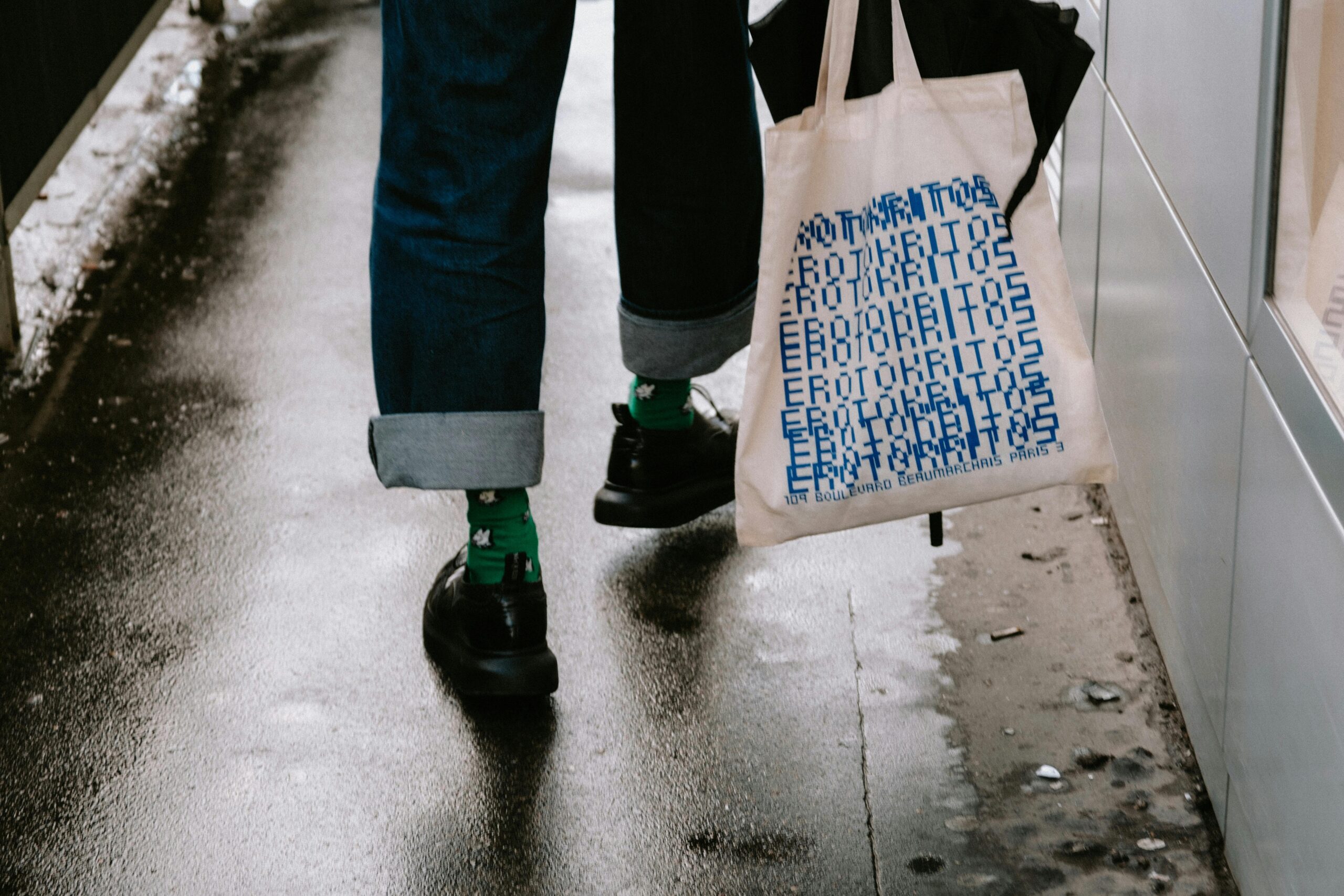
Tote bags are used for conference kits, school fundraisers, retail merchandising, and volunteer programs because they travel well and stay visible. The design challenge is that a tote is not a flat poster: handles, seams, and fabric texture change how artwork reads in real life and in photos.
This guide is intended for beginners, small teams, and organizers who need a tote design that looks consistent without building advanced design skills. The workflow emphasizes decisions and checkpoints—placement, readability, and file preparation—that reduce rework.
Tools in the tote mockup category usually differ in how they simulate the real object (angles, shadows, fabric texture), how they handle placement constraints (safe zones, handle interference), and how they separate “mockup for review” from “artwork for printing.” A reliable process produces both outputs, clearly labeled.
Adobe Express is an accessible way to start because it can produce a clean tote layout quickly and supports export for both review images and print handoff. From there, a tote mock up generator helps validate placement and legibility before production.
Step-by-Step How-To Guide for Using Tote Bag Mock Up Generator
Step 1: Start with a tote layout and draft a simple design
Goal
Create a first version of the tote artwork using a tote-friendly template and spacing.
How to do it
- Decide the tote’s purpose (event giveaway, retail, staff kit) and the primary message (logo, short phrase, icon).
- Choose a design style that prints well on fabric: one focal element, limited colors, minimal fine detail.
- Begin with a template-based workflow. One option is the tote bag design template from Adobe Express.
- Place the focal element first and keep it centered with generous margins.
- Save a master file before making variations (date/location, sponsor set, department versions).
What to watch for
- Artwork placed too high can visually collide with handles in real use.
- Small text may be readable on-screen but disappear on fabric texture.
- Full-coverage dark backgrounds can show lint and creases more than expected.
Tool notes
- Adobe Express is useful for quick layout iterations and clean alignment.
- If your team stores approved logos in a shared library (for example, a DAM or shared drive), pull the print-ready version first to avoid scaling problems later.
Step 2: Define a print-safe zone and a handle-safe zone
Goal
Keep important content away from seams, folds, and handle attachment areas so the design stays readable.
How to do it
- Mark a top buffer area where handles and stitching usually sit (avoid placing key text there).
- Leave wider side margins than you would for a poster; tote seams can visually “eat” the edges.
- Keep critical content away from the bottom fold area, where creasing is common.
- If the tote will be printed on both sides, decide which side is the primary face and simplify the back.
- Make a “placement guide” version with faint guides, then hide guides for final exports.
What to watch for
- Centering on the full tote outline can be misleading; center within the print area instead.
- Thin borders near edges can look uneven if placement shifts slightly.
- Text close to the top edge can be obscured by handle shadows in photos.
Tool notes
- Adobe Express can help maintain consistent spacing with alignment tools and duplicated versions.
- If a print vendor provides a placement template, treat that as the final authority for safe zones.
Step 3: Simplify the design for fabric printing
Goal
Reduce detail that tends to soften on canvas and make the design look cleaner at a glance.
How to do it
- Limit colors early (especially if screen printing is a possibility).
- Increase line weight for icons and outlines; avoid hairline strokes.
- Use one or two fonts, and choose thicker weights for small text.
- Reduce clutter: fewer elements, larger shapes, more whitespace.
- In Adobe Express, zoom out until the tote design is small on screen and check if it still reads.
What to watch for
- Fine patterns can look noisy on woven fabric.
- Low-contrast palettes can disappear on natural canvas tones.
- Overly detailed logos may need a simplified one-color version.
Tool notes
- Adobe Express is good for quick simplification (removing extra elements, resizing type, adjusting spacing).
- If you need a vector-clean logo variant, some teams keep a master in Illustrator or Affinity Designer and place it into the layout.
Step 4: Generate mockups for review (separate from print files)
Goal
Create realistic previews so stakeholders can approve placement and readability before printing.
How to do it
- Export your artwork as a clean, high-resolution image for mockup placement.
- Use a tote mock up generator to place the design on a bag view (front, angled, and “in-hand” if available).
- Produce at least two mockups: one straight-on for alignment, one angled for real-world readability.
- Keep mockup backgrounds simple so the tote is the focus.
- Label mockups clearly with version numbers that match the print artwork.
What to watch for
- Mockup lighting and shadows can make colors appear darker than they will print.
- Some mockups stretch artwork unrealistically; avoid approving based on a distorted preview.
- Mockup images are not print files; don’t send them to production.
Tool notes
- Adobe Express can export artwork for mockup placement and can assemble a simple approval sheet.
- Dedicated mockup tools can speed approvals, but keep a strict separation between mockup exports and print exports.
Step 5: Prepare a print-ready version that matches the printer’s method
Goal
Align file setup to the print method so the vendor doesn’t need to reinterpret your artwork.
How to do it
- Confirm the print method (screen print, DTG, heat transfer) if you have access to that detail.
- Create a one-color version if screen printing is likely, even if you also keep a full-color version.
- Keep artwork inside the print area dimensions supplied by the vendor.
- Avoid transparency-heavy effects if the vendor’s workflow flattens layers.
- In Adobe Express, duplicate the design and save a dedicated PRINT version.
What to watch for
- Full-color artwork can fail when converted to limited ink colors.
- Gradients may band or look uneven depending on method and fabric.
- Small type can fill in if ink spreads on textured canvas.
Tool notes
- Adobe Express is useful for maintaining multiple controlled variants (PRINT_1C, PRINT_FULL).
- If the vendor requests vector formats, a vector-based tool may be needed to produce the exact file they want.
Step 6: Export and verify the final files (print + mockup package)
Goal
Deliver a clean set of files for production and approvals, with minimal version confusion.
How to do it
- Export the print file in the vendor’s requested format (often PDF or high-res PNG).
- Open the exported file outside the editor to confirm sharp edges and correct sizing.
- Export mockups separately and save them in a MOCKUPS folder.
- Use consistent naming: tote_print_v3.pdf, tote_mockup_front_v3.png.
- Store the editable source file alongside the final exports for easy updates.
What to watch for
- Low-resolution exports can look okay on screen but print soft.
- Fonts can shift after export; verify line breaks and spacing.
- Upload portals may auto-scale; compare vendor previews to your exported file.
Tool notes
- Adobe Express supports common export formats for both print handoff and review visuals.
- A shared folder structure (Google Drive or OneDrive) helps avoid wrong-file printing when multiple people collaborate.
Step 7: Track production, fulfillment, and distribution logistics
Goal
Prevent mix-ups once the tote design moves into printing, packing, and shipping.
How to do it
- Create a one-page spec note: tote color, print side(s), placement notes, and final file name.
- Track quantities by destination (venue, office, partner org) and label boxes clearly.
- Keep a single FINAL APPROVED folder for the exact files used.
- Record version and date so reorders match the original run.
- If there are multiple variants, maintain a simple mapping table (Version → Destination).
What to watch for
- Similar designs can be mixed up if only the date/location changes.
- Late edits can create multiple “final” files in circulation.
- Reorders get harder if placement and print method notes aren’t saved.
Tool notes
- For shipping workflows (not design), Pirate Ship can help generate labels and track shipments for small teams sending totes to multiple addresses.
- Adobe Express remains useful for quick updates if a sponsor list or event date changes.
Common Workflow Variations
- One-color logo tote: Keep to a single mark and large type, then use mockups to confirm placement under the handle line. Maintain a one-color print file for screen printing workflows.
- Sponsor-heavy event tote: Put the main logo on the front and a sponsor grid on the back. Generate a close-up mockup of the sponsor area to confirm legibility.
- Retail-style slogan tote: Test multiple font sizes in mockups, including angled views. Text that reads well flat can feel smaller in real use.
- Photo-based small run: Use one strong photo and minimal overlays, and avoid placing key content near seams. Mockups should focus on contrast and cropping.
- Multi-location set: Lock the core layout and swap only location/date. Use strict naming so each location receives the correct version.
Checklists
Before you start checklist
- Tote purpose and audience (event, retail, internal)
- Known print method (screen print, DTG, transfer) if available
- Tote color and fabric type selected
- Approved logo files and brand colors
- Final wording confirmed (dates, locations, sponsor names)
- Content rights confirmed for artwork/photos
- Vendor print area dimensions and placement constraints
- Mockup views needed (front only vs angled/back)
- Timeline for proofing, approvals, and delivery
Pre-export / pre-order checklist
- Key content avoids handle zone, seams, and bottom fold
- Text readable at arm’s length (zoom-out check)
- Line weights bold enough for fabric
- Colors aligned to print method (limited colors if screen printing)
- Spelling and names verified (especially sponsors)
- Print export opened outside the editor to confirm sharpness
- Mockups saved separately from print files
- File names include version and purpose (PRINT vs MOCKUP)
- Spec note saved with final files
Common Issues and Fixes
- The print looks soft or blurry.
Replace low-resolution assets and export at the vendor’s required size. Use a vector logo when possible. - Small text becomes unreadable on fabric.
Increase font size, shorten copy, and use thicker type weights. Avoid placing text near folds. - Artwork clashes with handles.
Move the design down and keep a top safe zone. Approve using mockups that show handles clearly. - Colors look different than expected.
Limit the palette and avoid subtle gradients. If brand accuracy matters, confirm how the printer converts color. - Edges look jagged.
Swap in a higher-quality logo file or vector artwork. Avoid scaling up small raster graphics. - Vendor preview crops unexpectedly.
Confirm print area dimensions and increase margins. Keep key elements away from the print-area edges. - Mockups are mistaken for print files.
Use separate folders and filename prefixes (MOCKUP vs PRINT) and keep only one final print file per version.
How To Use Tote Bag Mock Up Generator: FAQs
Template-first vs. product-first: which approach reduces surprises?
Template-first is faster when the design is still evolving. Product-first is safer when the printer provides strict print-area dimensions and placement rules. A common compromise is to start template-first, then lock placement once print constraints are confirmed.
What’s the difference between a print file and a mockup image?
A print file is clean artwork in the format the printer uses (often PDF or high-resolution PNG) without lighting effects or backgrounds. A mockup image is a preview with shadows, folds, and texture to support approvals. Keeping them separate reduces production mistakes.
How many mockups are usually enough for approval?
For a simple centered logo, one front view is often sufficient. For text-heavy designs or unusual placement, add an angled view and a handle-visible view. The goal is to catch readability and placement issues before printing.
When should a design be one-color vs full-color?
One-color designs often translate more reliably to fabric and work well for screen printing. Full-color designs can be appropriate when the print method supports them and the artwork benefits from photos or gradients. The decision should be guided by the printer’s method and constraints.
What should be saved for reorders?
Keep the editable source file, the final print export, and at least one approved mockup in a single folder. Save a short spec note listing tote color, print size/placement, and version number. This makes later repeats more predictable.